
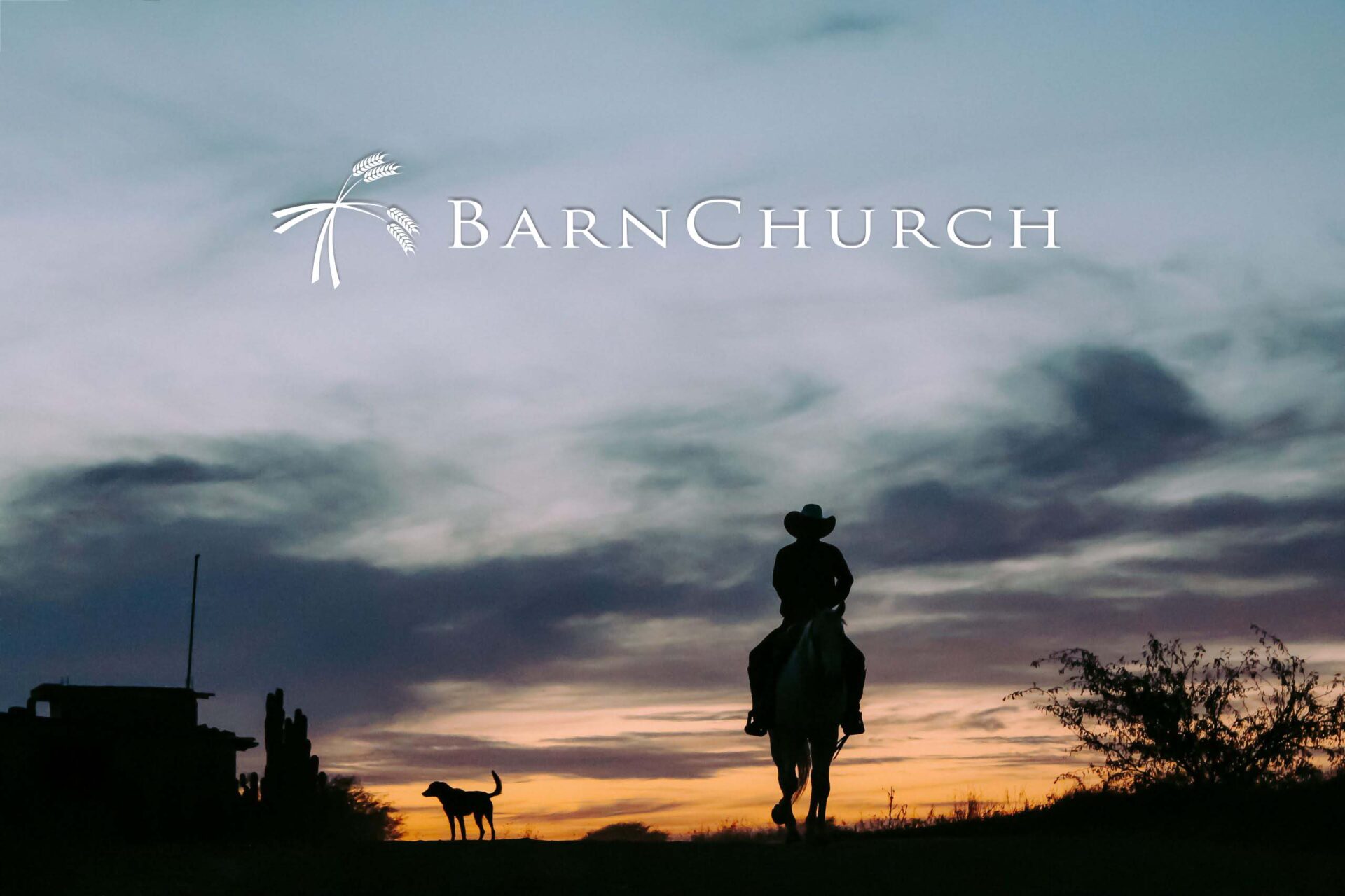
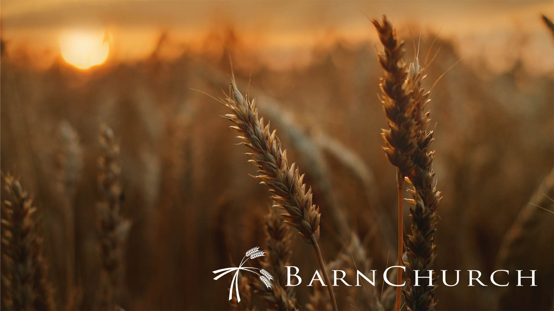
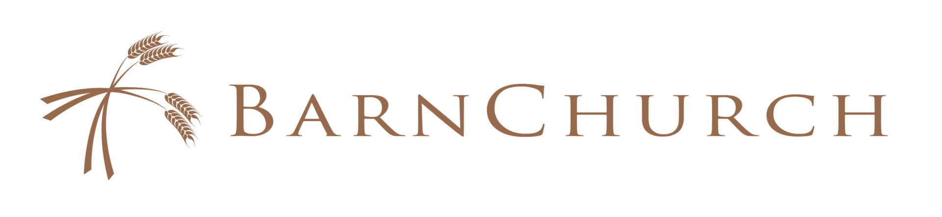
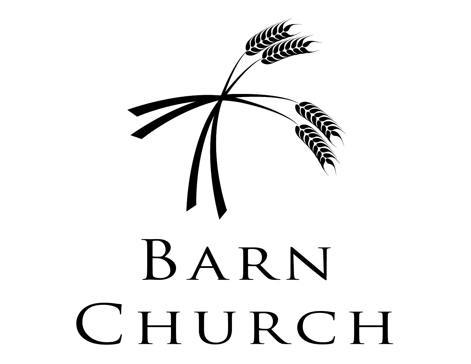
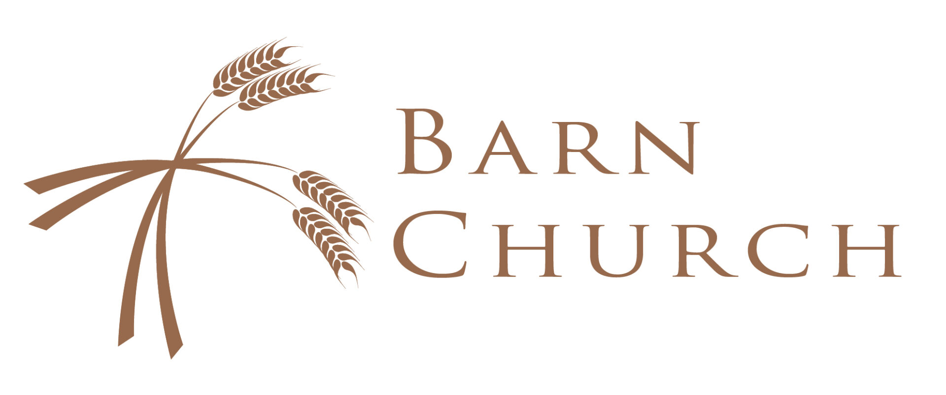
Cowboys, harvest, bounty, community, and faith. How do you distill all of these archetypes into a symbol to represent a church that meets inside an indoor rodeo arena? I faced this challenge nearly 20 years ago, and chose bearded stalks of ripe wheat laid out in a cross.
This logo endured beyond anything I could have imagined.
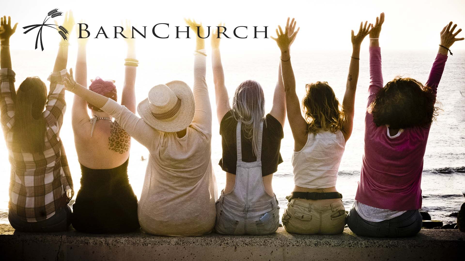
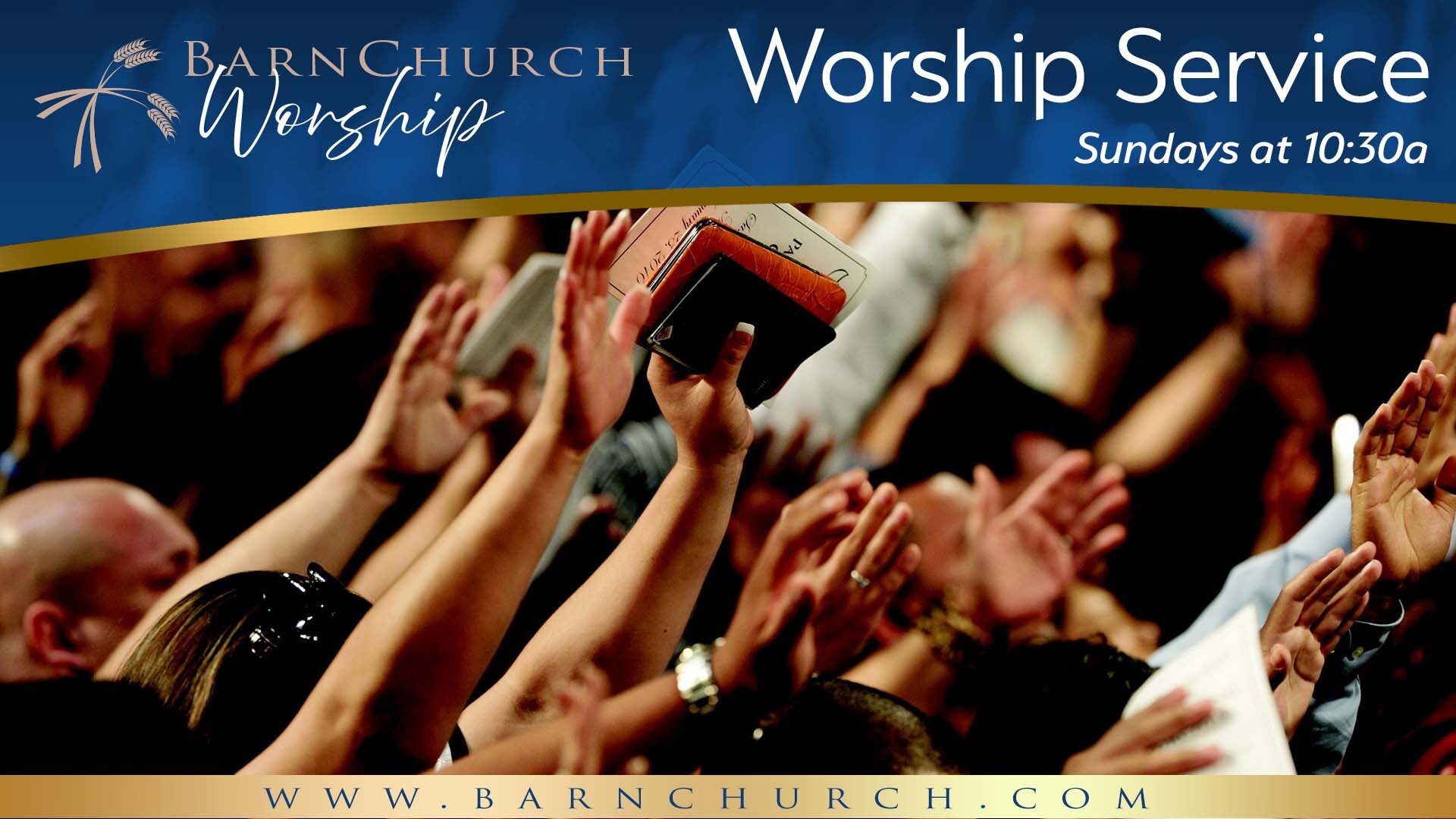
It embodies my philosophy of logo design: simplicity yields versatility. This logo is a work horse, used on business cards, projector displays, baseball caps, websites and much more than can be listed here. It is the symbol of your organization. Its essence. It will be used in ways you cannot imagine.
Below, I’ve included a small taste of the different formats of this particular logo that looks as good today as it did 25 years ago.
Design and layout by Zac Walker, mixed media.

