Creating the brand book for this client demanded the same core principles I use for all brand guidelines: consistency, usability, clarity, and aesthetics.
Colors must contrast sufficiently to be used in multiple combinations. Fonts include uniquely decorative typefaces, but also clean and clear fonts for readability.
Logos must be presented in all useable configurations. All of this must be presented in a coherent package usable by church employees and production professionals, including saving each logo variation in every format they might need in the future.
This book is canon for a brand. An organization’s strong and unique identity requires it.
Design and layout by Zac Walker, in paper and digital formats.
Gallery
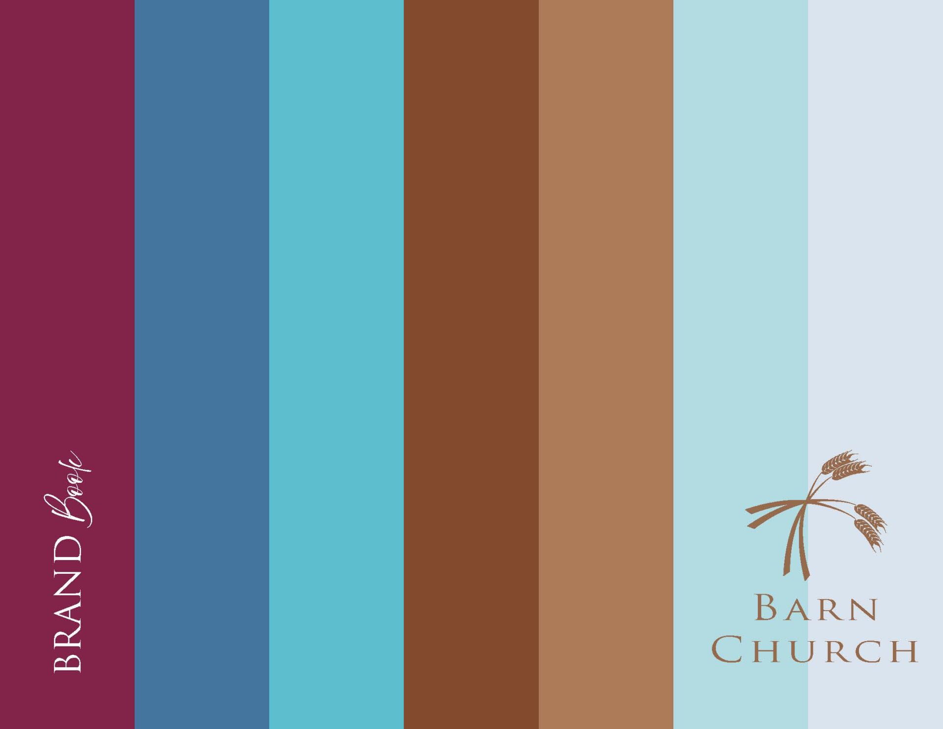
Barn Church Brand Book Cover
Barn Church Brand Book Cover. My brand book covers communicate multiple facets of a client's brand style in an elegantly spare configuration to arrest but not exhaust the eye.
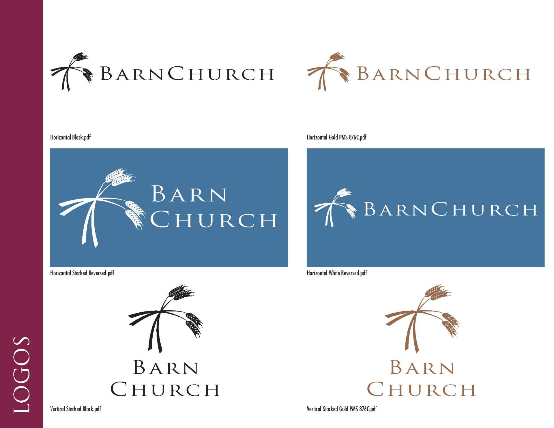
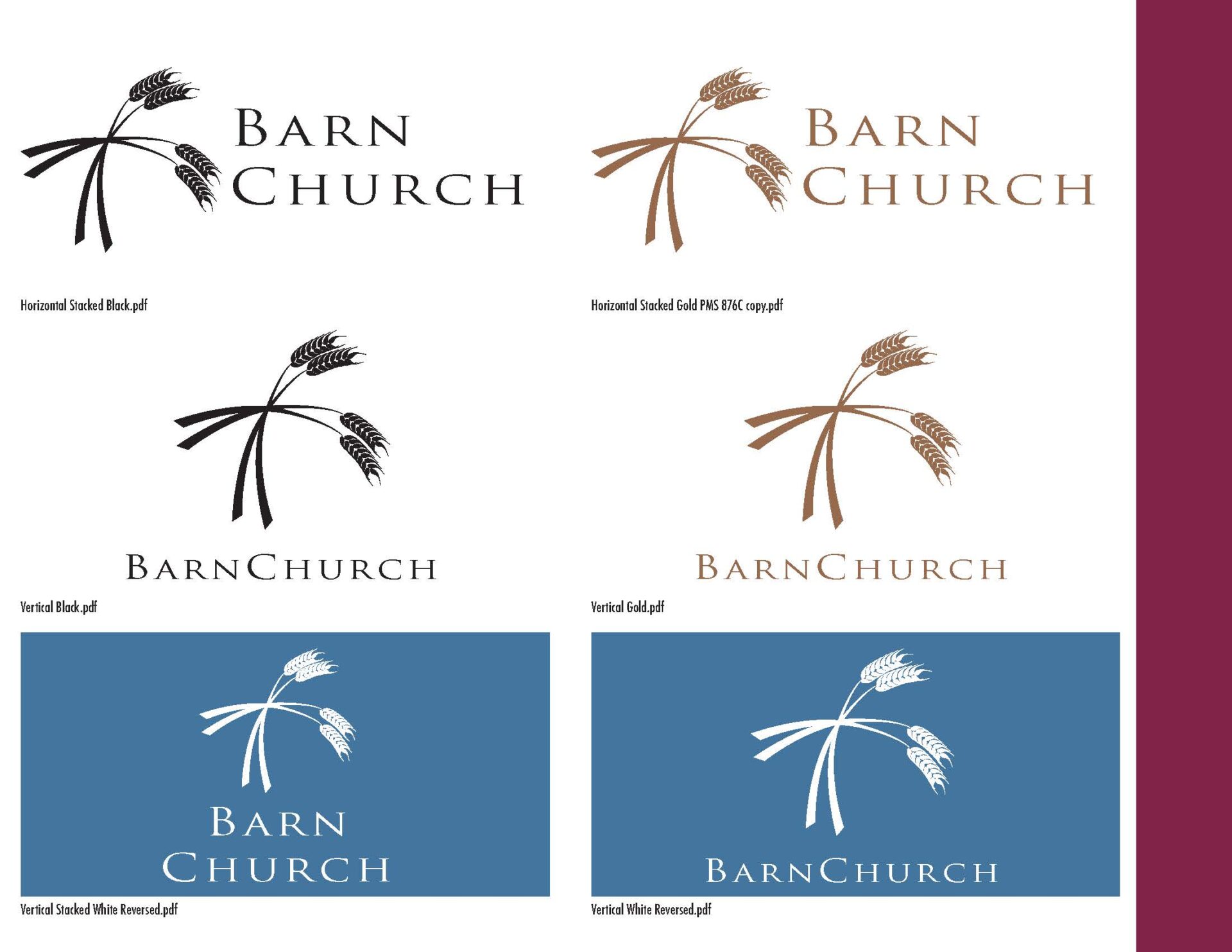
Barn Church Brand Book Logo Configuration 1
Barn Church Brand Book Logo Configuration. If a logo doesn't work in flat black on white, the logo simply does not work. In my experience, logos will be printed, projected, embroidered, and even dyed into cloth. Most of those methods require a single, flat color. Furthermore, logos must be handed off to the client in all useable configurations to best fill available space, and in the approved brand colors. All of this must be presented in a coherent package usable by church employees and production professionals, including saving each logo variation in every format they might need in the future.
Barn Church Brand Book Logo Configuration 2
Barn Church Brand Book Logo Configuration. If a logo doesn't work in flat black on white, the logo simply does not work. In my experience, logos will be printed, projected, embroidered, and even dyed into cloth. Most of those methods require a single, flat color. Furthermore, logos must be handed off to the client in all useable configurations to best fill available space, and in the approved brand colors. All of this must be presented in a coherent package usable by church employees and production professionals, including saving each logo variation in every format they might need in the future.
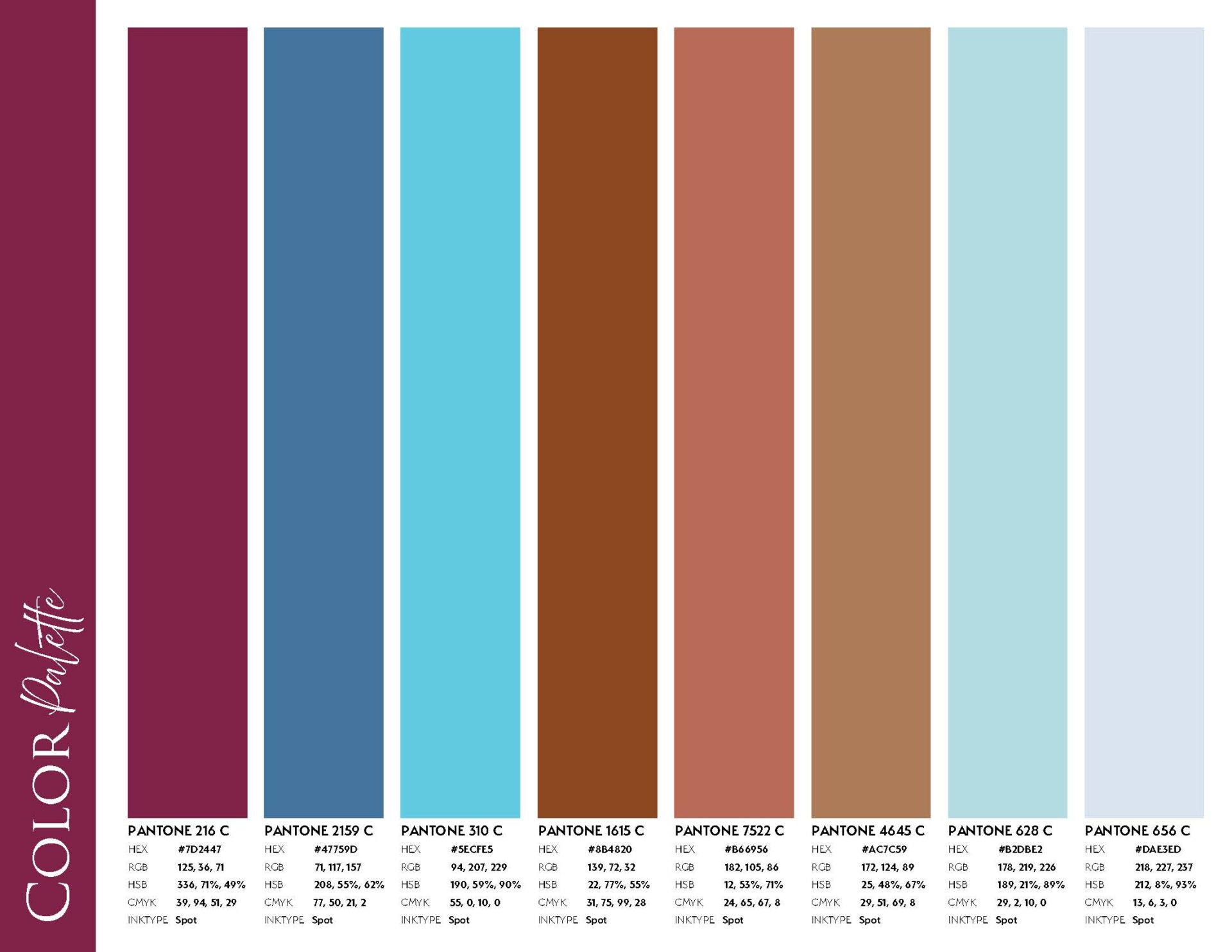
Barn Church Brand Book Color Theme
Barn Church Brand Book Color Theme. Colors must contrast sufficiently to be used in multiple combinations yet harmonize with each other. A mix of light and dark assures brand compliance on everything from websites to billboards, and that dark text contrasts sufficiently with a light background without clashing, and vice versa. The Pantone Color Matching System guarantees color fidelity across all forms of production, as does the information for all major color gamuts, neatly presented here.
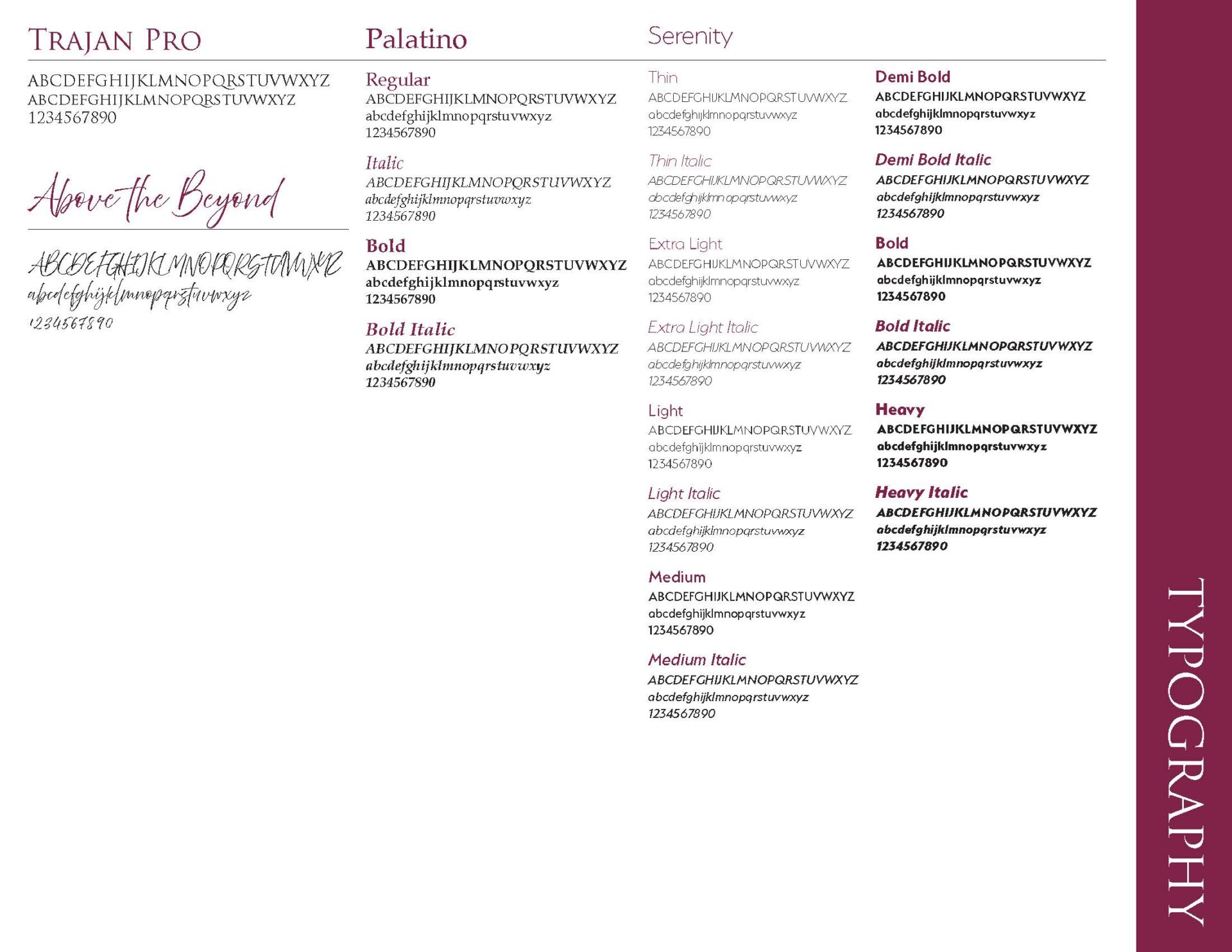
Barn Church Brand Book Typography
Barn Church Brand Book Typography. Typefaces are as vital to brand identity as logos because they do most of the work of communicating to customers. Fonts should include uniquely decorative typefaces for visual impact, but also clean and clear fonts for readability. For Barn Church, the stately Trajan Pro couples beautifully with the striking Above the Beyond script. These, however, should be used sparingly. The Primary fonts are the classic Palatino, and finally the clean yet modern Serenity which includes fourteen styles for maximum variety.


