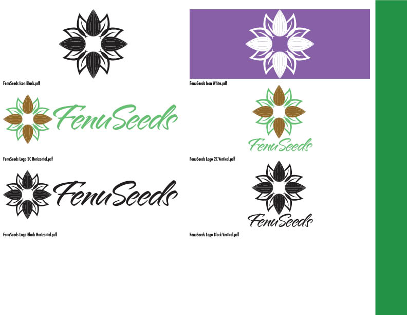
Creating the first logo for a new product is a blessing and a curse: a blessing because you have a blank slate, and a curse because you have a blank slate.
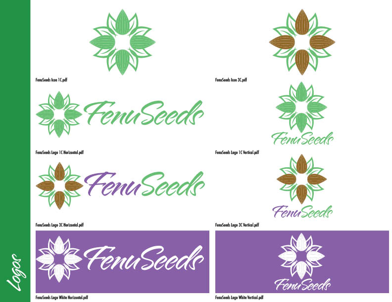
The fundamentals should never be compromised: if it doesn’t work in flat black on white, it doesn’t work.
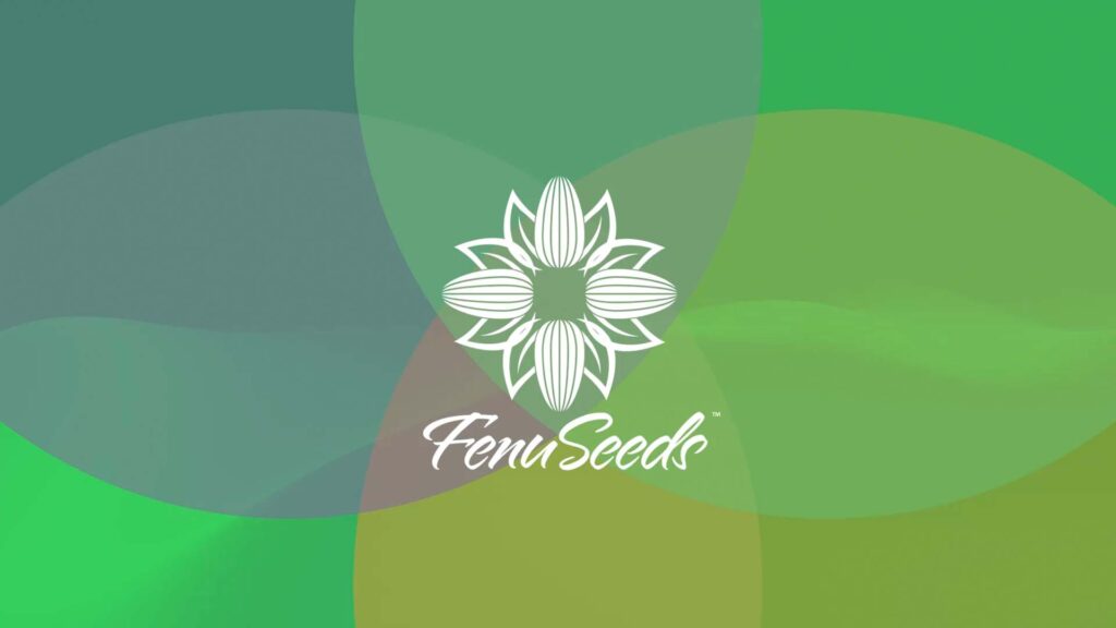
We made a decision to call upon the culture of the country that produces the product from field to bottle.
For me, the choice could not be clearer: a mandala. As a devotee of powerful and beautiful geometry, my love for sacred design had been well established long before I worked with a South Asian client.
As the goal was to see the product on grocery store shelves, the rest of the brand fell into place.

