
In 2008, I was charged with rebranding an entire company from top to bottom. A new logo, new packaging across more than 100 products from five completely unrelated product lines. Every public facing aspect of the company had to be rethought, redesigned, and implemented
Everything had to be at once identifiable with the company, but individual identities for the product lines had to be easily distinguishable.
Distinct, but part of a whole.
The Product Guide is the greatest expression of that effort.
One in a series of books for the ForMor International Distributers kit, the Product Guide remains the most technically and creatively difficult project I have ever undertaken.
Every design element, both in the guide and on almost all of the products within, I designed, from layout to packaging to merchandise. The sprawling product line of the company across varied interests challenged me to find a way to present them all in a logical and easy-to-use fashion, while maintaining the highest standards of design and branding.
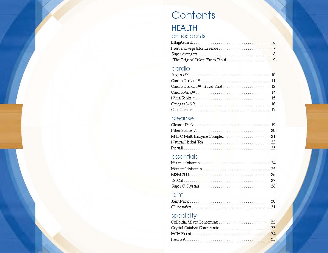
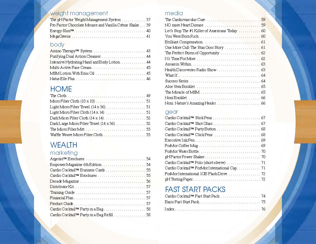
The blue geometry along the margins gave the guide its specific theme, but the notches in the middle of the left and right margins changed color to aid in finding specific product lines. They formed colored blocks when viewing the unbound edge of the book straight on.
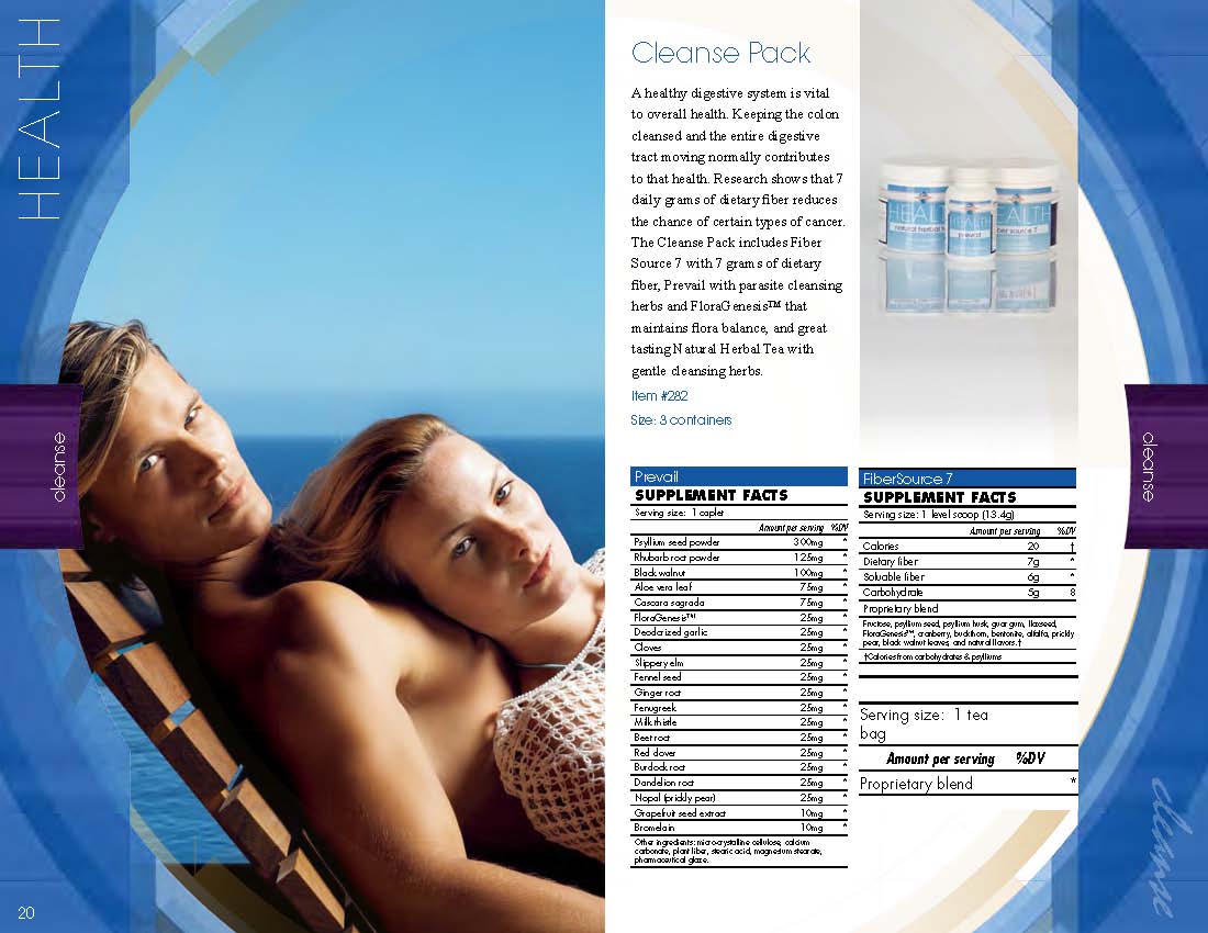
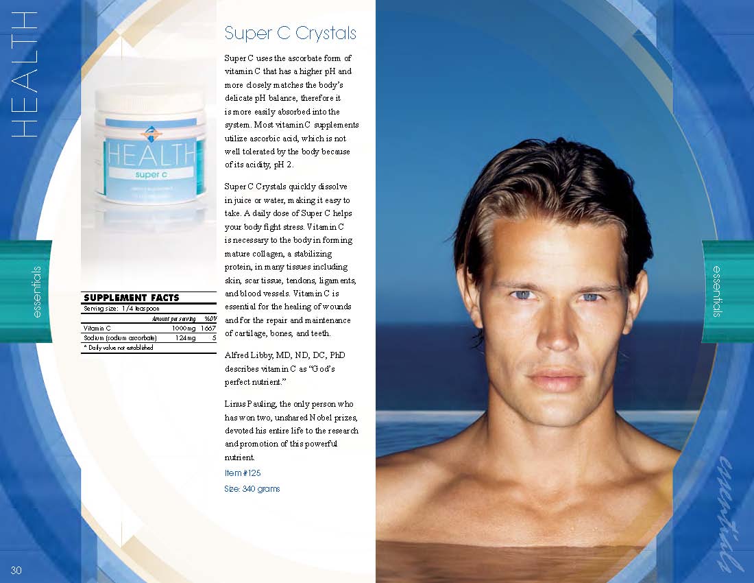
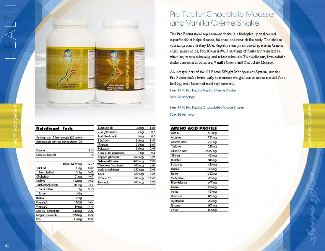
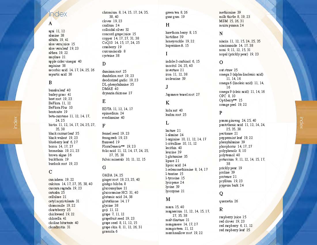
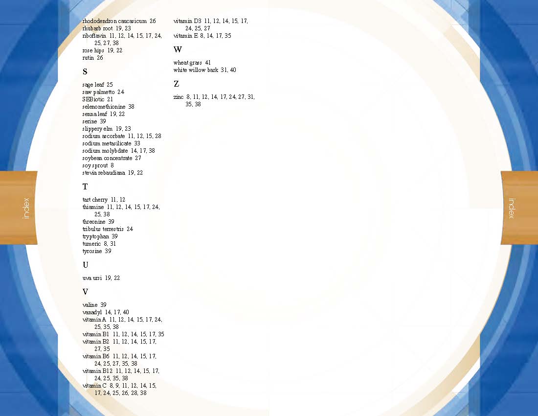
Using the power of pro-level layout software, I marked each ingredient in every supplement facts panel in the Health section, allowing the software to create a dynamic and comprehensive index of ingredients used in the company’s nutritional supplements line.
As this project approaches its 20th anniversary, I remain proud of the piece and how it has endured the tests of time.


