
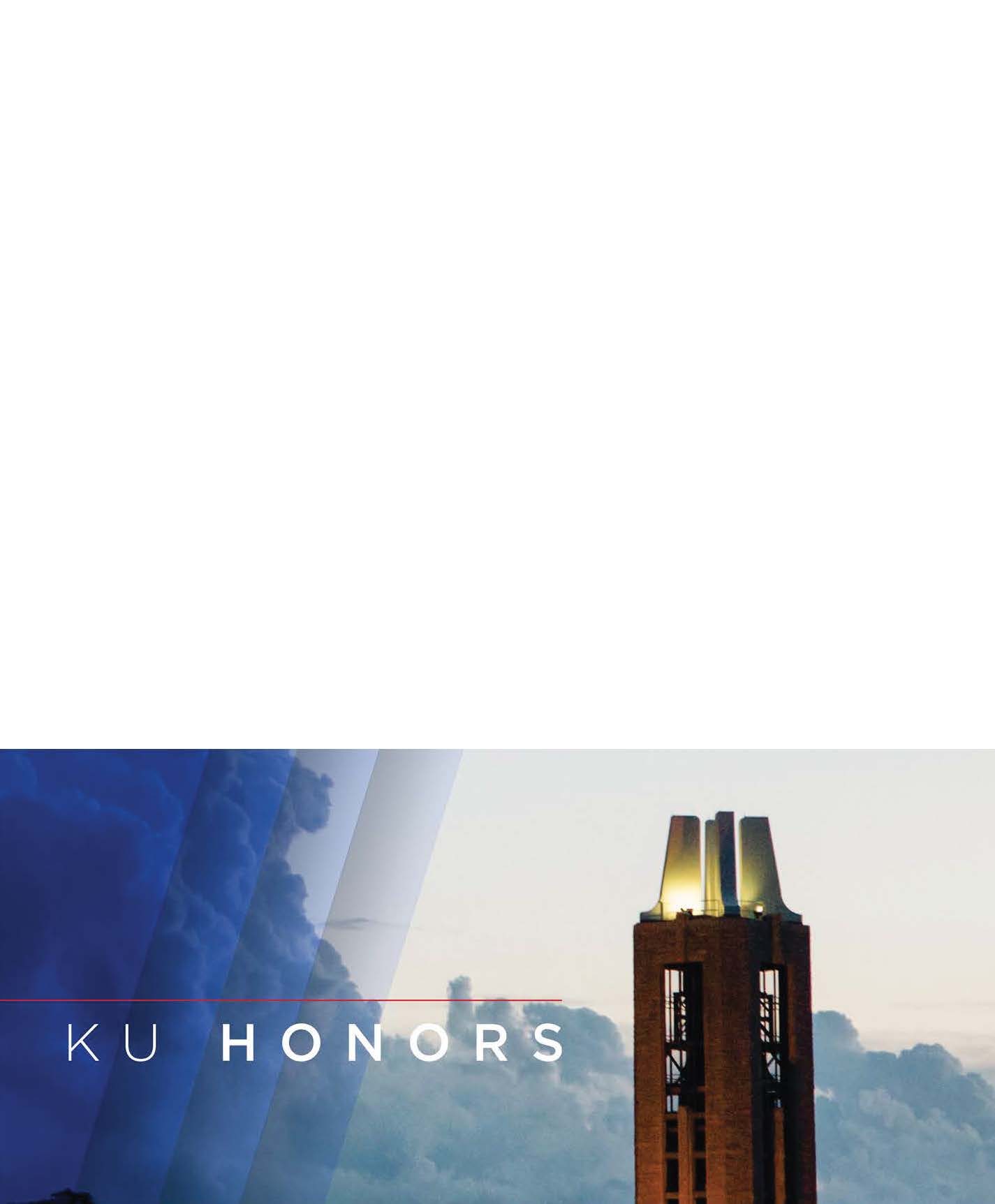
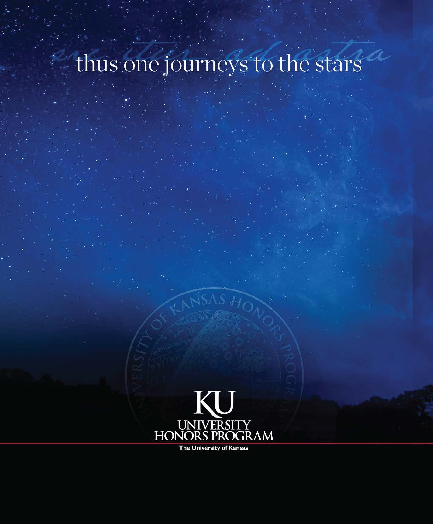
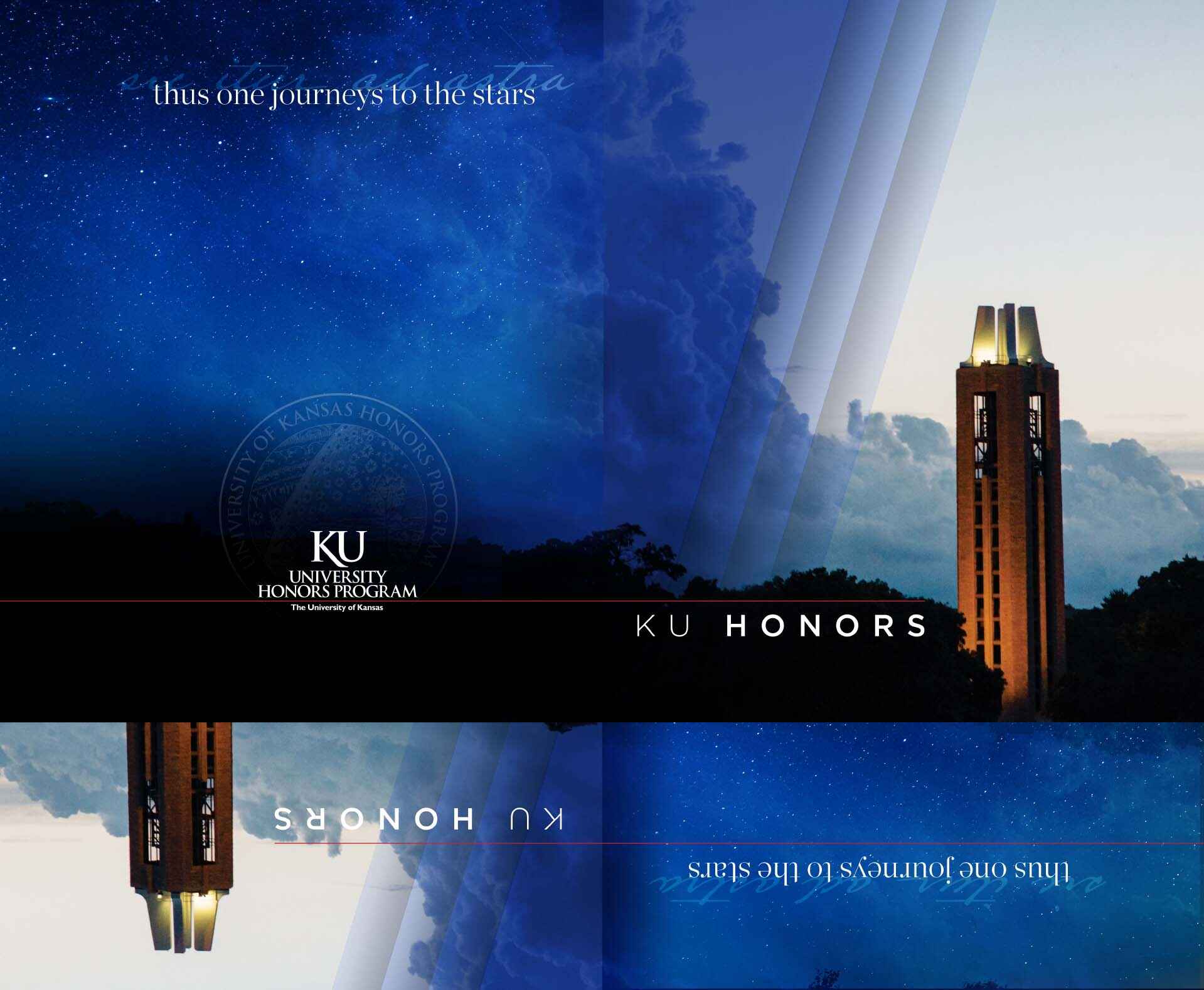
For the University of Kansas Honors Program, one of the most critical printed projects they produce is the Freshmen Orientation Packet. This folder, designed to contain the various elements of the packet, embodies the finalized brand design language I created for the program: gorgeous photography from the University’s marketing department takes center stage, accented by slanting bars of increasing transparency (a riff on another University design element), and the program’s name type treatment.
I have frequently said that working with the University of Kansas Honors Program was, fittingly, quite an educational experience.
The program needed its own brand; however, it had to abide by the branding standards of the University. I created the first elements of their new brand to find that every element had to be approved by the University’s marketing department. I then found that almost everything I had done up to that point was rejected.
I have worked in design long enough to understand a seeming paradoxical truth: creation flourishes under constraints.
Working with the marketing department, we finally arrived at brand expression that satisfied all parties.
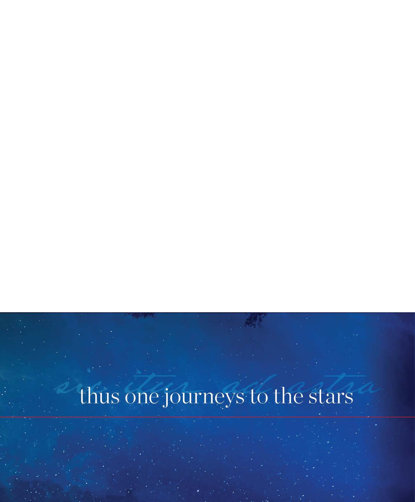
I employed KU’s official color palette of rich dark blue, crimson red, and vibrant yellow. The program’s motto “sic itur ad astra,” “thus one journeys to the stars” received a type treatment that became a staple of the design language.
We quickly learned that this folder served a multitude of purposes beyond orientation week. We kept hundreds of these on hand throughout the year.
The challenge for me was to create a unique and beautiful design vocabulary but remain within the University’s brand requirements.
Long ago, I learned that creativity flourishes under constraints. This piece is a superb example of this axiom.


