When I began working with the University of Kansas Honors Program, one of the most prestigious honors programs in the country, one concern dwarfed all others: the program needed a distinct and instantly recognizable brand, while remaining visually a part of the University’s brand.
No small challenge.
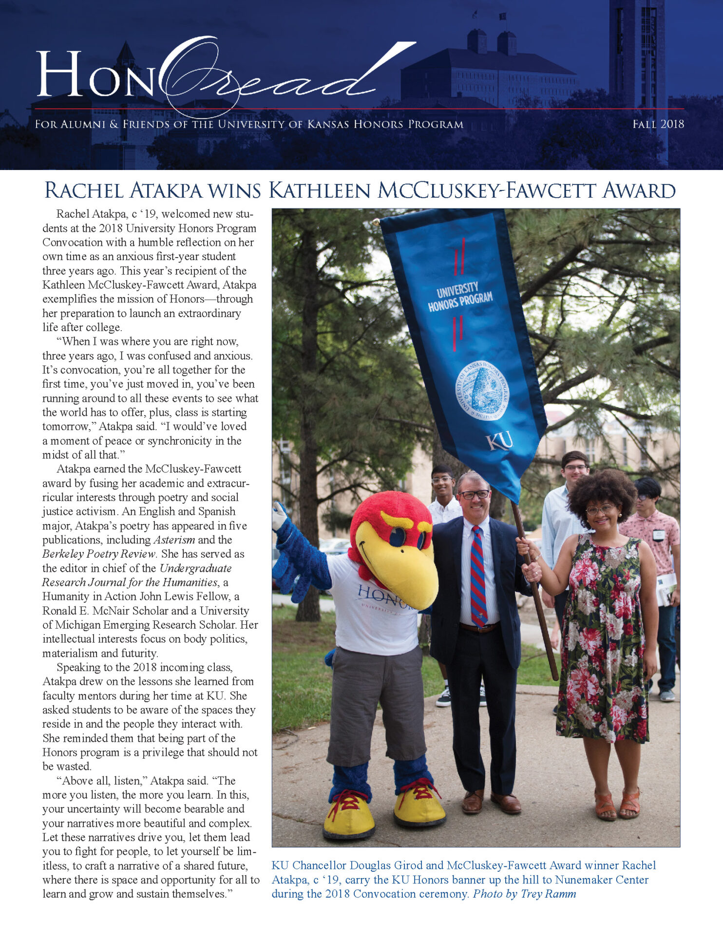
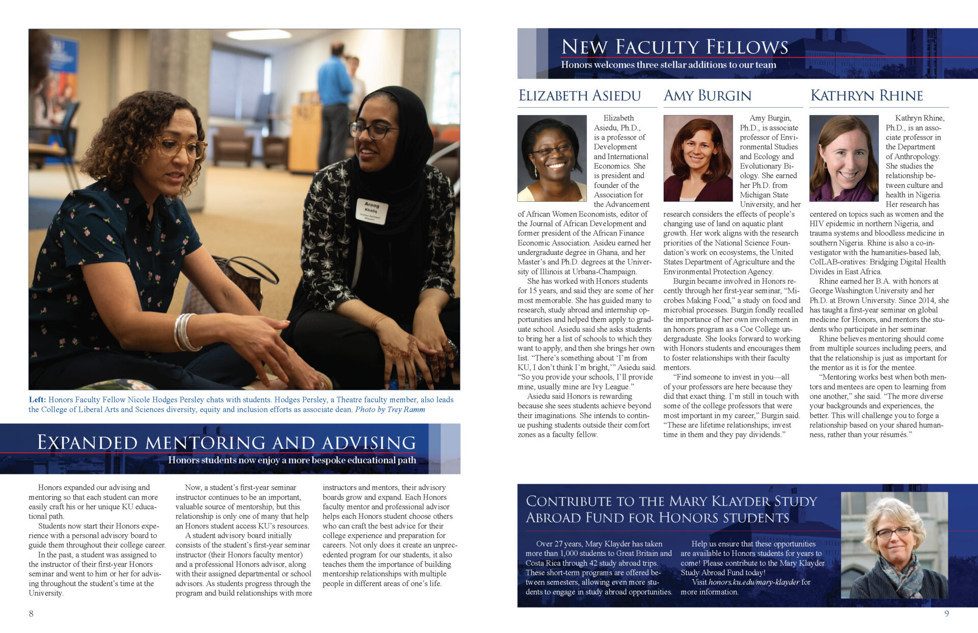
It was a learning experience for me, to be sure. One of the first projects I redesigned was their quarterly newsletter, arguably their most important piece as hundreds of alumni and donors received it.
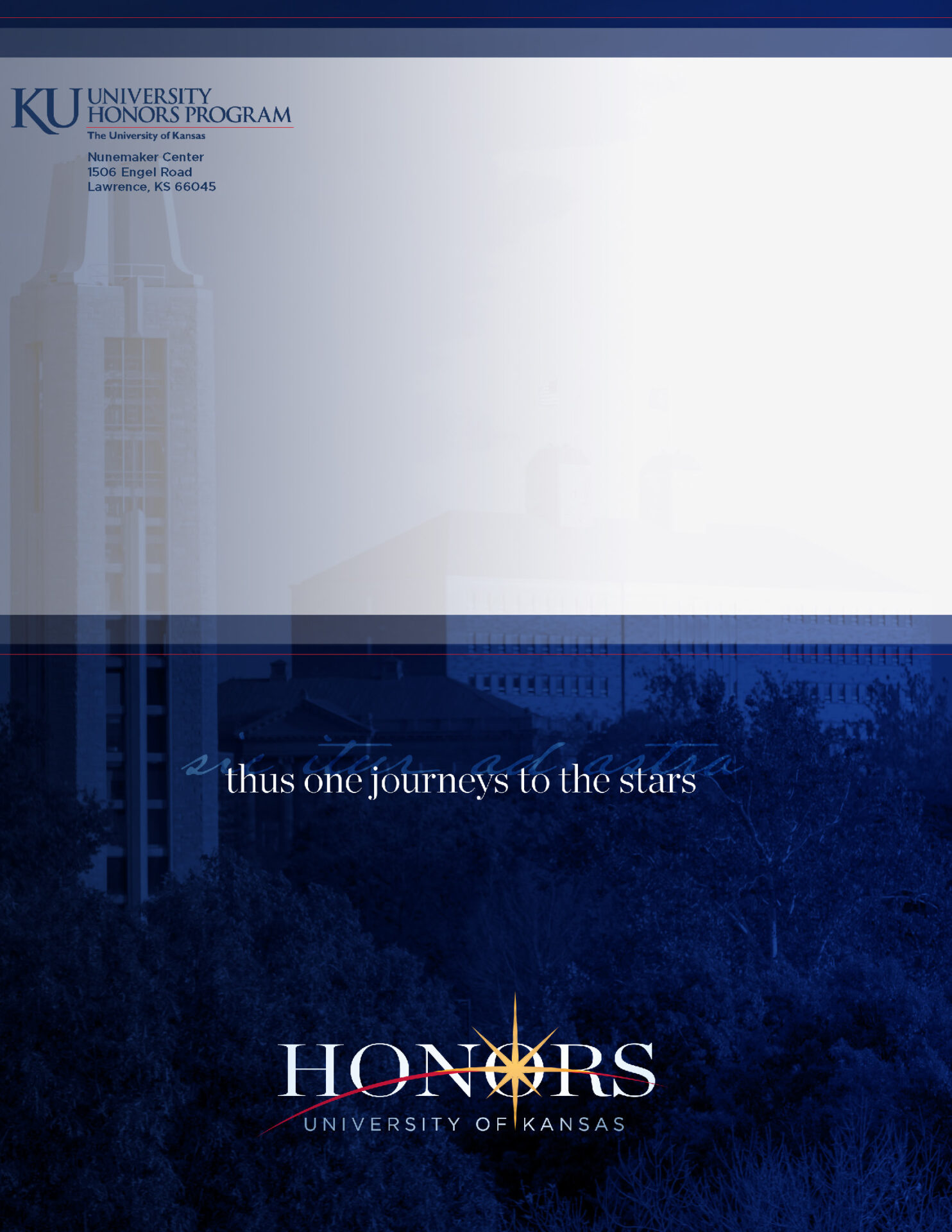
I employed KU’s official color palette of rich dark blue, crimson red, and vibrant yellow. The program’s motto “sic itur ad astra,” “thus one journeys to the stars” received a type treatment that became a staple of the design language.
The name of the newsletter, “The HonOread,” is a portmanteau of “honor” and “Oread,” after Mt. Oread upon which the university was built.
This piece remains special to me as it marks a pivotal moment for the program as its new brand took shape.


